28th May, 2020
People like to trust in companies before moving forward with them, be it signing up for a service, buying a product or collaborating, people like to know they’ll be safe. A great way to start the trust building (and we do mean start, earning and keeping a customer / clients’ trust comes at every level of your business) is to share with them who else has trusted you.
Worked with some big names in your industry? Have household names on the books? Let people see, show companies’ logos as a badge of honour, and use a piece of their shine to help legitimise yourself.
When people come across your site for the first time, chances are they want their information fast, and easily digestible at a glance, we know the browser of today wants information, and information quickly. This is the same on all levels, from how your website performs, to the content present on your site. The great thing about logos is, they’re designed to be recognisable, so a grid of them can really help booster trust building quickly.
Now, without further ado, let’s get into the nitty-gritty of displaying them.
The Codebase
We’ll start with a simple list, by default they’ll how display horizontally, but we can fix that with styling later…
<ul class="logos">
  <li class="logos__holder"></li>
  <li class="logos__holder"></li>
  <li class="logos__holder"></li>
  <li class="logos__holder"></li>
  <li class="logos__holder"></li>
  <li class="logos__holder"></li>
  <li class="logos__holder"></li>
  <li class="logos__holder"></li>
</ul>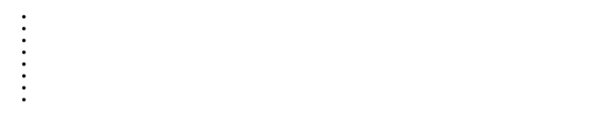
Exciting! We’ve got our very own list of black dots! For starters, we need to place some styles in to get rid of the default styling lists have…
.logos {
  margin: 0;
  padding: 0;
  list-style: none;
}
This will remove the black dots, the margin top and bottom, and the padding to the left, leaving us back with just a blank screen.
So, before adding the logos to the list we will work on the grid layout. Adding the following to the SCSS will give us a grid, which will be completely responsive. We will also add some visibility to the li items.
.logos {
  display: grid;
  grid-template-columns: repeat(auto-fill, minmax(140px, 1fr));
  row-gap: .5em;
  column-gap: 1em;
  ...

  &__holder {
    height: 100px;
    border: solid 2px #d84548;
  }
}
Let’s break down this magical line:
grid-template-columns: repeat(auto-fill, minmax(140px, 1fr));To get an understanding of how this line works, take the following example:
grid-template-columns: repeat(8, 1fr);This simply says, repeat 1fr 8 times. If we weren’t using the repeat function, it would appear as:
grid-template-columns: 1fr 1fr 1fr 1fr 1fr 1fr 1fr 1fr;1fr repeated 8 times will give 8 equals parts. fr, is a unit, which means fraction. So, looking back at our original declaration, instead of a number telling the repeat function how many times to repeat, we have autofill. Autofill fills the row with as many columns as it can fit.
On the right side of our repeat function, the second argument, we have minmax(140px, 1fr). This essentially says, don’t get smaller than 140px, and don’t get larger than 1fr. This keeps everything perfectly sized. All items in a row will stay exactly the same size.
So to conclude, this style gives us an always aligned fully responsive grid layout where we can change the minimal size in one area.
With this code in place we see:
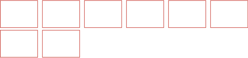
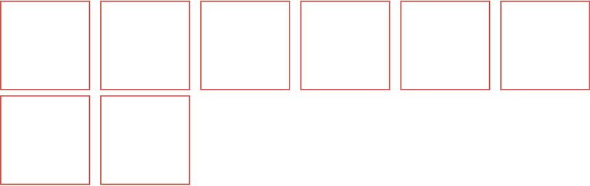
Let’s make theses boxes square, to do this we will use a padding trick on a before pseudo element:
.logos {
  ...

  &__holder {
    ...

    &:before {
      content: "";
      display: block;
      padding-bottom: 100%;
    }
  }
}
Note: the set 100px height has now been removed.
This gives us our square grid for the images!
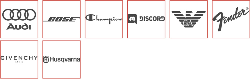
Now, to continue this, we’re going to add the logos, you’d be using logos of companies that represent some kind of affiliation. For this example, however we’re just going to take some random logos from World Vector Logo. We’ll add the SVG logos in the li’s…
<ul class="logos">
  <li class="logos__holder">
    <svg class="logos__logo" width="100%" height="100%" viewBox="0 0 2500 2500" xmlns="http://www.w3.org/2000/svg">
      ...
    </svg>
  </li>
  <li class="logos__holder">
    <svg class="logos__logo" width="100%" height="100%" viewBox="0 0 2500 2500" xmlns="http://www.w3.org/2000/svg">
      ...
    </svg>
  </li>
  <li class="logos__holder">
    <svg class="logos__logo" width="100%" height="100%" viewBox="0 0 2500 2500" xmlns="http://www.w3.org/2000/svg">
      ...
    </svg>
  </li>
  <li class="logos__holder">
    <svg class="logos__logo" width="100%" height="100%" viewBox="0 0 2500 2500" xmlns="http://www.w3.org/2000/svg">
      ...
    </svg>
  </li>
  <li class="logos__holder">
    <svg class="logos__logo" width="100%" height="100%" viewBox="0 0 2500 2500" xmlns="http://www.w3.org/2000/svg">
      ...
    </svg>
  </li>
  <li class="logos__holder">
    <svg class="logos__logo" width="100%" height="100%" viewBox="0 0 2500 2500" xmlns="http://www.w3.org/2000/svg">
      ...
    </svg>
  </li>
  <li class="logos__holder">
    <svg class="logos__logo" width="100%" height="100%" viewBox="0 0 2500 2500" xmlns="http://www.w3.org/2000/svg">
      ...
    </svg>
  </li>
  <li class="logos__holder">
    <svg class="logos__logo" width="100%" height="100%" viewBox="0 0 2500 2500" xmlns="http://www.w3.org/2000/svg">
      ...
    </svg>
  </li>
</div>
Note: for this example we’ve removed the actual SVG code, you can find this in full on the CodePen.
You’ll see that the boxes have got longer (not wider though, thanks to our minmax function), and the logos are at the base. This is because our padding bottom trick to get square.
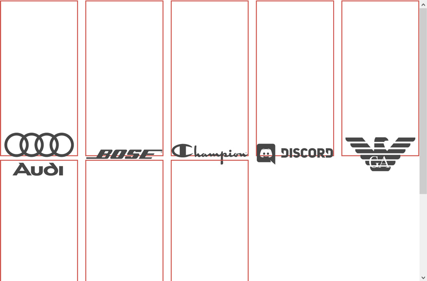
To fix this, we need to place the logo on top of the before pseudo element. We will use position absolute on the logos to fix this.
.logos {
  ...

  &__holder {
    position: relative;
    ...
  }

  &__logo {
    position: absolute;
    top: 0;
    bottom: 0;
    right: 0;
    left: 0;
  }
}
The logos will now sit in line perfectly…
Remove the borders on the li and we’re finished! The full SCSS is as follows:
.logos {
  display: grid;
  grid-template-columns: repeat(auto-fill, minmax(140px, 1fr));
  row-gap: .5em;
  column-gap: 1em;
  margin: 0;
  padding: 0;
  list-style: none;

  &__holder {
    position: relative;

    &:before {
      content: "";
      display: block;
      padding-bottom: 100%;
    }
  }

  &__logo {
    position: absolute;
    top: 0;
    bottom: 0;
    right: 0;
    left: 0;
  }
}
To see this in full, and to test the responsiveness (change the width of your browser and watch how the logos react) view the CodePen. The CodePen has a few styles which are purely for presentation, but these will be marked with comments.
If you like our tutorials, make sure to check out our previous one. Creating a Clipped Text Effect.
Luke