30th April, 2020
What’s better than a CSS trick? A simple one!
Today we’re going to look at a little CSS trick which can yield fantastic results. This trick uses a combination of two styles which work together to give a great clipped text effect, let’s jump in!
We’re going to use CodePen here so you can take a look over and edit our codebase as you wish. I’ve got some simple styles that I’ve added as a starting block for us, these are…
HTML Starting Point:
<div class="clip">
  <h1 class="clip__text">Coffee</h1>
</div>
SCSS Starting Point:
.clip {
display: flex;
align-items: center;
justify-content: center;
width: 100vw;
height: 100vh;
background-image: url('https://www.tidydesign.com/blog-resources/clipped-text-post/clipped-text-effect-background.jpg');
background-size: cover;
background-position: center;
&__text {
font-family: 'Merienda One', cursive; // Making use of Google Fonts
font-size: 6rem;
}
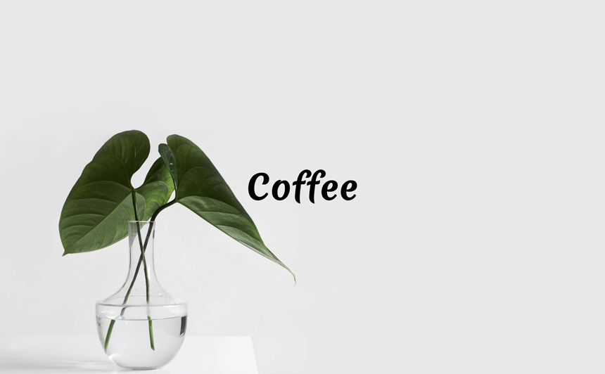
}This starting point places our text in the centre of our page, and gives us a nice clean background image (image credit to Sarah Dorweiler). It’ll look like this…
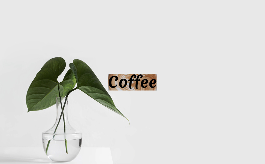
Now we’ve got our starting point ready, it’s time to focus of the trick itself. We start by adding a background image to our text. We’ve selected an appealing looking photo of a freshly poured coffee for our example (image credit to Lex Sirikiat). We’ll centre and cover this background image on our text too.
.clip {
  ...

  &__text {
    ...
    background-image: url('https://www.tidydesign.com/blog-resources/clipped-text-post/clipped-text-effect-main.jpg');
    background-size: cover;
    background-position: center;
  }
}
Now, we’re going to see the first of the two styles which give us our results, background-clip. We use background-clip with a value of text. We will also add the vendor prefix webkit…
.clip {
  ...

  &__text {
    ...
    background-clip: text;
    -webkit-background-clip: text;
  }
}
It looks like our work has been reverted! We’re left with our text back to black.
This is where the final part of the trick comes in…
.clip {
  ...

  &__text {
    ...
    -webkit-text-fill-color: transparent;
  }
}
Adding this you’ll see the great clipped effect we’ve been looking for! Now, as you might have guessed from the use of the vendor prefix, support isn’t everywhere for this trick. Can I Use is a great tool for checking where styles are supported. These properties aren’t supported by IE, but can be used with most major browsers using the webkit prefix. See the Can I Use results here background-clip, -webkit-text-fill-color.
To cover the lack of support by IE we will pass a graceful fallback of a simple text colour. This way, if we are in IE, we can show a colour similar to that of the image we’re using.
.clip {
  ...

  &__text {
    ...
    color: #9f7452;
  }
}
This makes sure we aren’t left with just boring black text for IE users…

Bonus Round
Now, we’ve used a background image for this example, but we aren’t limited to just images! If we revert back to the starting point we created earlier, we can use a gradient too.
.clip {
  ...

  &__text {
    ...
    background-image: linear-gradient(90deg, rgb(138,82,47) 0%, rgb(160,126,98) 57%, rgb(195,173,150) 100%);
    background-clip: text;
    -webkit-background-clip: text;
    -webkit-text-fill-color: transparent;
  }
}
If you visit the CodePen, and change the class modifier on the h1 between clip__text–image and clip__text–gradient you can switch between both examples. We’ve made sure to clearly separate to SCSS for you too, take a look over and see what effects you can come up with!
I imagine this post has left you craving for either one or two things. If it’s coffee, check this recent post from Mike containing some awesome free coffee illustrations, if it’s simple CSS tricks, check out this post which goes over how to make a cut out text effect.
Luke