13th April, 2020
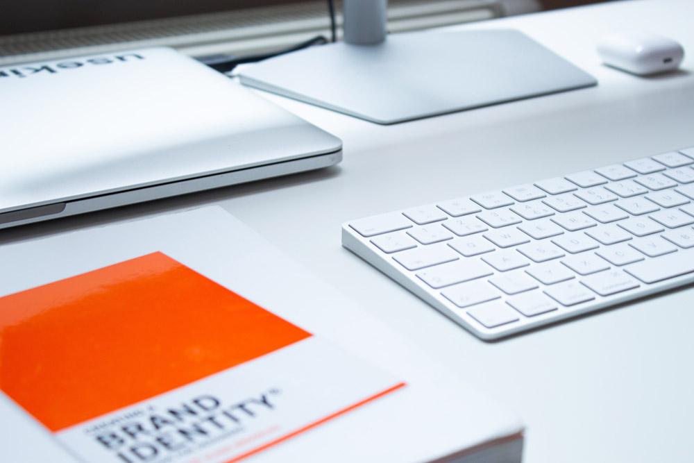
Prior to starting a new project we like to get a feel for your business, its ethos, sector and review any company branding. If you do not have a colour palette or logo, then this is something we can help you develop.
What is a brand palette?
Your brand palette exists to make you recognisable to your followers and customers. It exists to deliver consistency across all media. Think about your website, email signature, business card designs etc. These should all adopt the same font family, logo, colours and styling. So a brand palette tells everyone how things should look.
Another branding consideration is what do you offer, what do you stand for and what do you aim to deliver. These things need to be embodied within your brand, consistency kept throughout all promotional and marketing material. You may wish to consider an icon pack or a style of photo, something to stitch it all together.
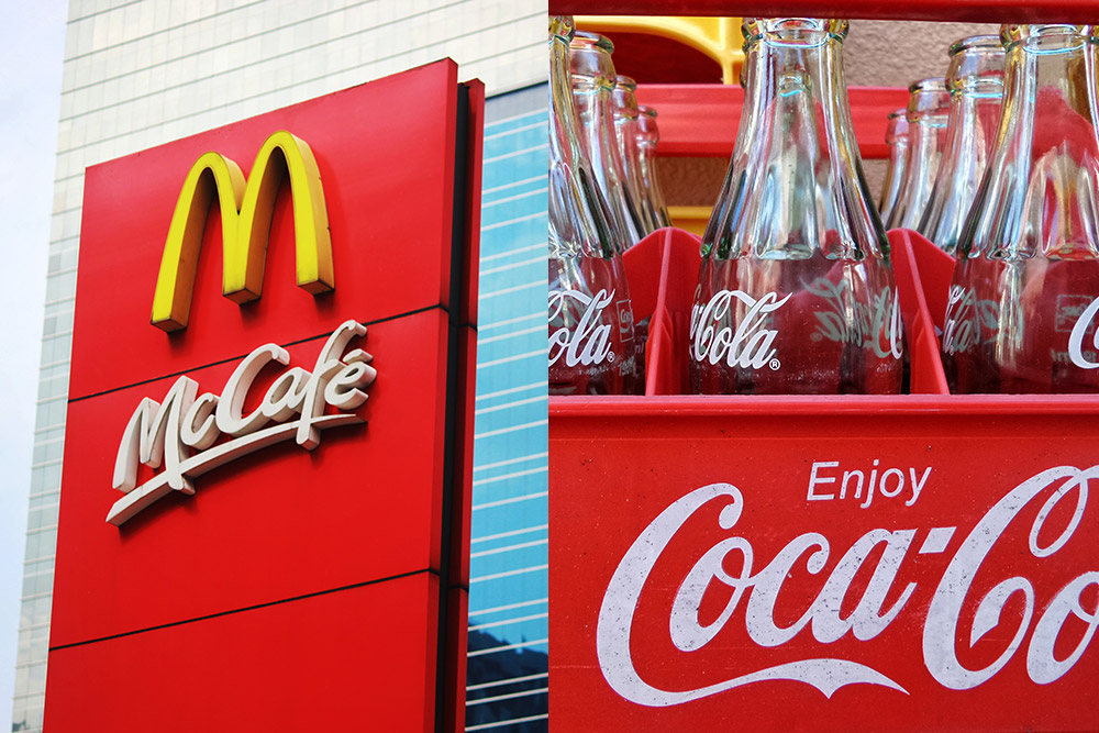
Well known brands are often linked to certain shapes or colours, be it the golden “M” of McDonald’s or the red colour of Coca-Cola, these two brands deliver unique personalities. Both are synonymous with their sectors, fast food and fizzy drinks.
Many different things can impact how people view a company, the colour palette is simply one of them. Colours evoke both emotion and response, so it is important to consider both when building your own colour palette. You may find the following post of interest, the colour red. This looks at our own Tidy Design colours and a 2020 re-brand.
Please don’t underestimate the importance of a brand palette, it delivers a foundation for us all to build on. We should (as business owners, employees and designers) aim to deliver consistency. Ensuring that the message(s) we choose to relay, are well received by our customers.
A few brand palette designs
Choosing brand palette colours (or creating a logo) becomes easier when we know what you’re trying to communicate. Before we start, why not put together a list of phrases or keywords that cover your target audience. As well as this, why not write up a sector or business summary, maybe a mission statement.
Below you will find a few brand palettes that we have created for our awesome clients over the years. Littol Creations is a company based in San Diego, below is some feedback on their logo design and our design process.
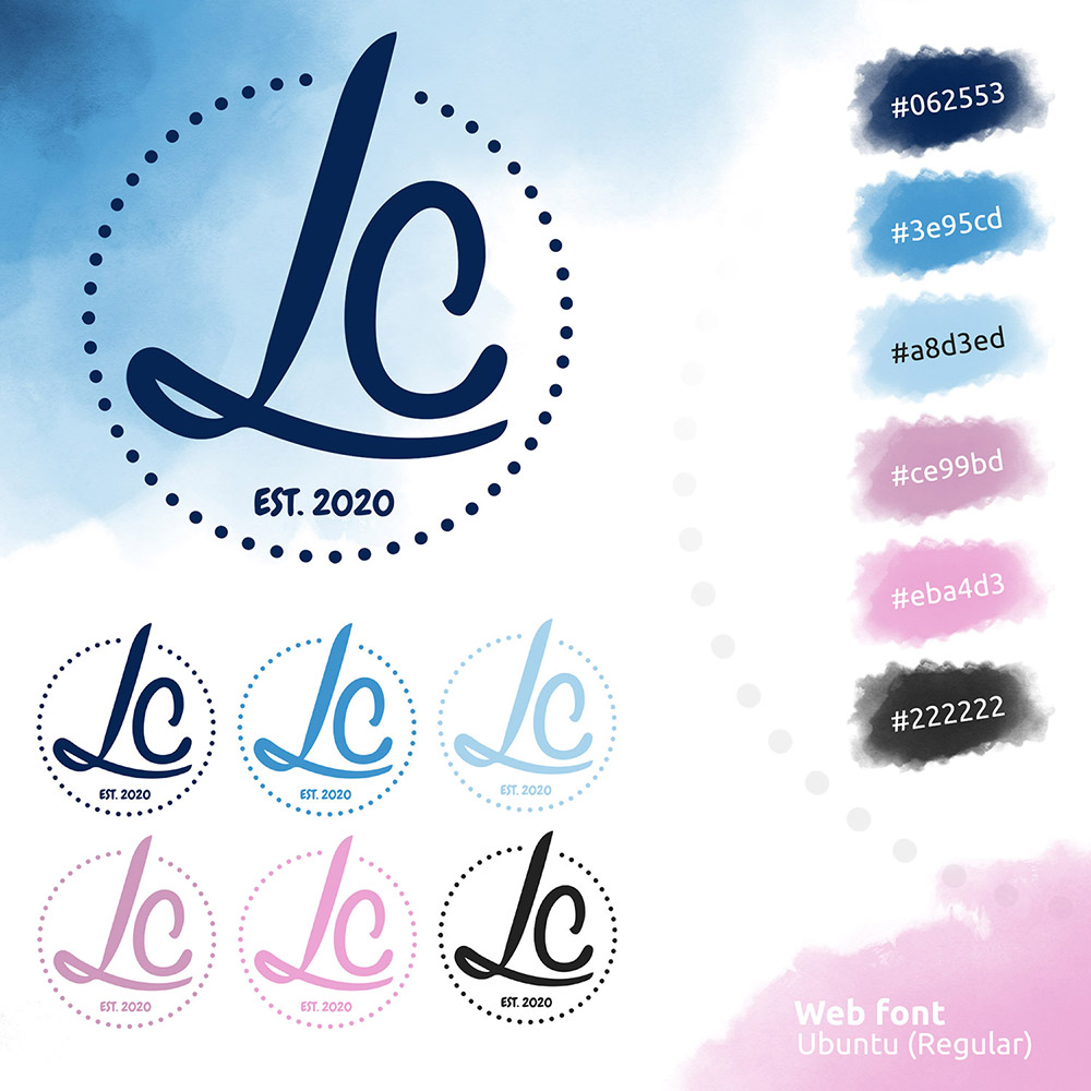
“I was a little nervous about the website design process as it came with so many different elements, each that I wanted to be perfect! Tidy Design put me at ease straight away, working with my many ideas, expectations and thoughts while also teaching me along the way. Mike helped me realise the effectiveness and purpose of a simple logo, he helped me understand branding on a different level and worked with me to create the ideal colour palette for my site. My initial ideas were moulded and influenced by Mike and the outcome was very different but I couldn’t be happier. I couldn’t have asked for a better person to collaborate with on this project and I am very excited to see what the next step will bring.”
— Littol Creations
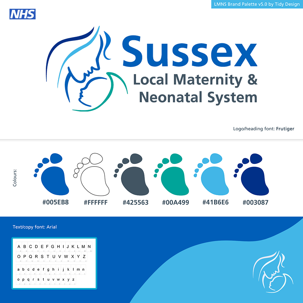
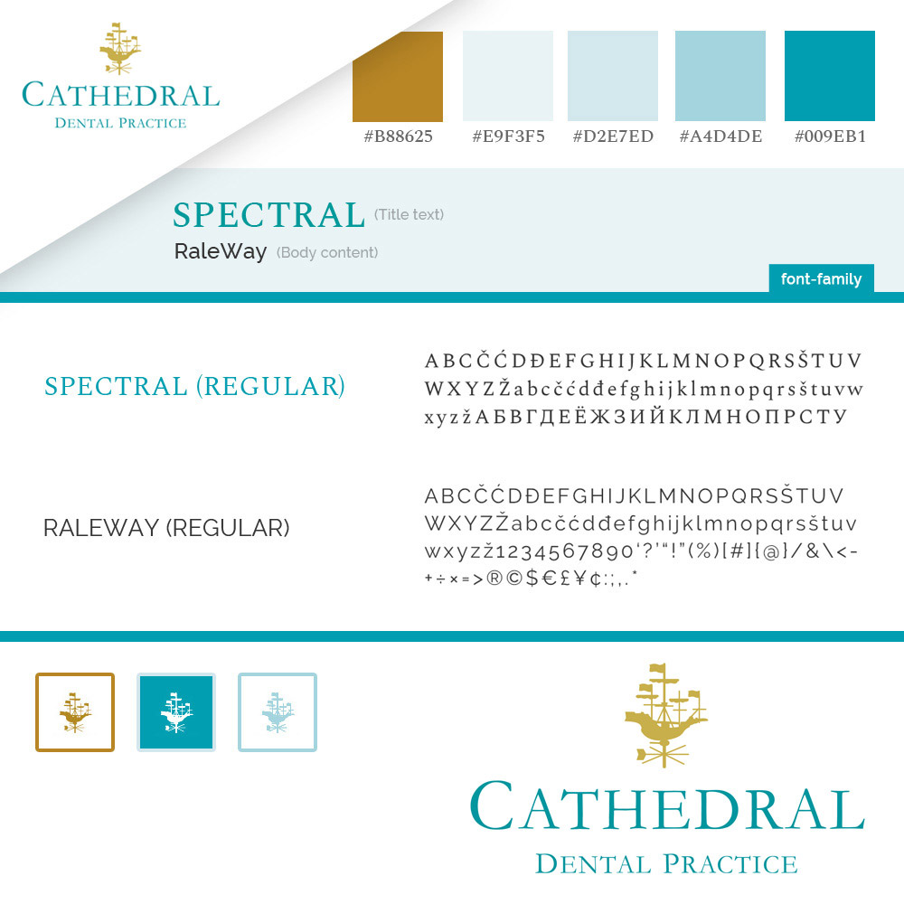
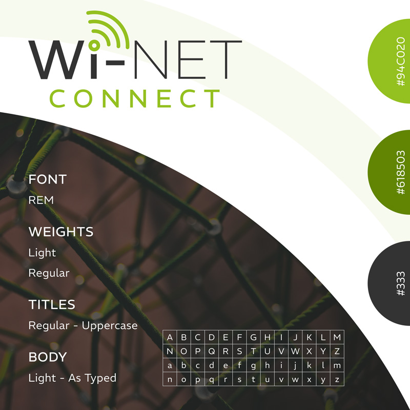
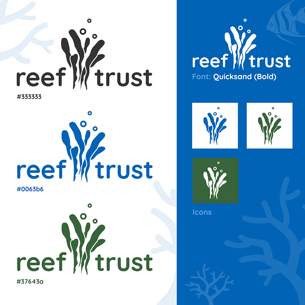
Here are some more brand palettes we have designed, a mix of sectors and industries.
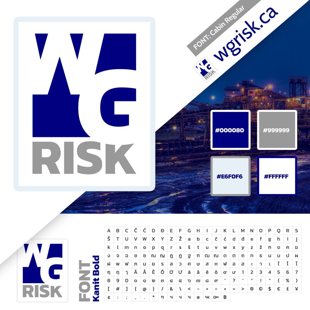
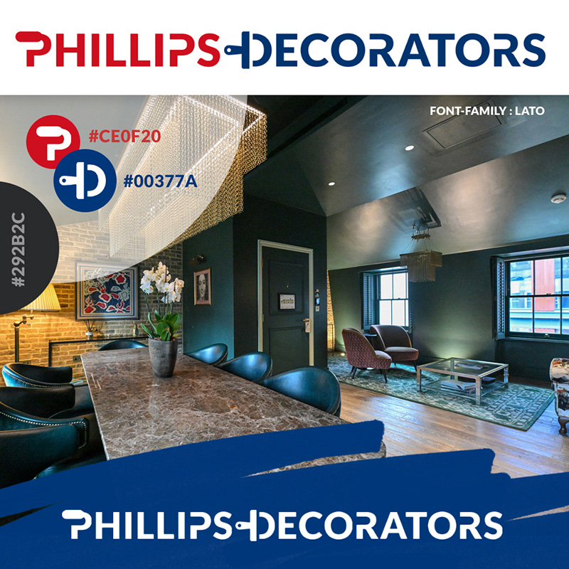
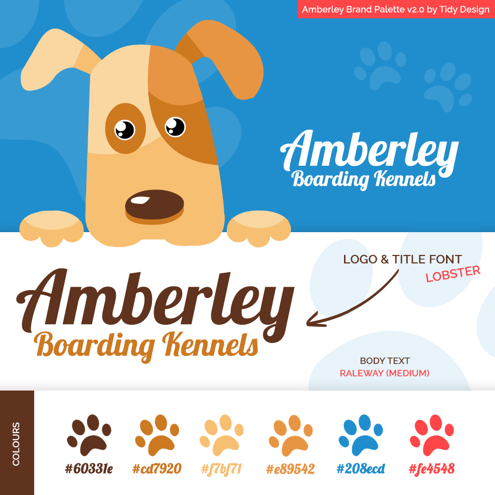
![]()
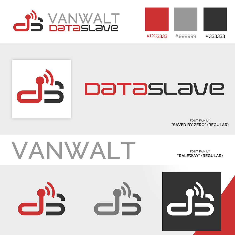
Please visit our Case Studies page for more brand development work. Or please feel free to contact us with any questions, we’d be happy to help. Following the creation of a brand palette or logo it is truly awesome to see our work in the real world. I really like the DataSlave logo we designed above, and how it incorporated equipment functionality. Another favourite of mine is HeliOperations and the helipad logo. Seeing this on the side of helicopters or a hanger is pretty epic!
![]()
Brand palette tips
Your colour scheme should have between 1-4 main colours, but think about your base. Your base colour should reflect the core business value, but also appeal to your customers. Throughout the design and development of your brand, keep an end-goal in mind. How your logo and colours combine will spill into many different areas of your business. Why not ask for feedback or input from others.
Colour summary
I thought a quick colour summary would contribute well to this post, adding some food for thought. A reminder of what each colour stands for and means to others.
Red
Passion and determination. Think CTA’s (call to actions) to join or sign in, think “Sale” banners or Santa Claus! Red is associated with energy and love…
Orange
Playfulness and energy. Think vitamin C, warmth, vibrancy and health. A colour that attracts attention, but it’s not as “in your face” as red…
Yellow
Happiness and optimism. Think smiley faces (emojis), fun and low cost. Like with orange and red it offers warmth, the colour of the sun, hope and positivity…
Green
Prosperity and nature. A colour associated with grass, plants and trees. Another association is being given the “green light”. To go ahead or take immediate action…
Blue
Trust and purity. A calming coastal colour that portrays professionalism, intelligence and responsibility. Think social networks, a universally liked colour that caters for everyone…
Purple
Luxury and royalty. Because of its association with royalty, purple can be seen as both prestigious and luxurious. Adding a gold tint would really help to magnify this…
Pink
Femininity and innocence. This cute colour can represent femininity or romance. Pink can be also be seen as sweet, young, playful and charming…
Brown
Old-fashioned and earthy. Think farming, agriculture or outdoor activities. This is a warm and neutral colour, it can be seen as dependability, solid as an oak…
White
Clean and minimal. White can represent a clean slate, purity and innocence. Both modern and minimalist, often used as a background colour so text is easy to read…
Grey
Neutrality and serious. Think grey hair, maturity and wisdom. Grey is a serious colour, for when you want to communicate authority or stability…
Black
Sophisticated and luxurious. This is a bold and powerful colour, black can also be seen as a little mysterious. Luxury brands often use the colour black…
Colour and design
Please note; the colour combinations you decide to use will be impacted by the design and style they are used in. This is something to consider when creating your brand palette. For example; a red box will not have the same meaning nor impact as a red heart shape.
Branding & Design Company in Portsmouth
Are you looking for a brand identity, a branding palette or brand re-design? Are you looking for a digital design company based in Portsmouth, Hampshire (UK)? Here at Tidy Design our mission is simple; to deliver a return on investment. Each day we set out to offer our customers a quality service, the goal being to leave a long lasting and positive impression. Happy customers result in repeat business.
We believe a strong brand identity will provide a company value beyond physical assets. It is worth the time investment, it is something us business folk should step back & review every so often…
If you liked this post then please check out UX Design Hampshire or Social Media Advertising. We’d love to hear from you, discuss your project or branding plans, why not contact us today.
Until next time, keep it tidy!
Mike