6th March, 2020
“To simplify, we’ll be switching to mobile-first indexing for all websites starting September 2020.”
Is it time to panic?!
Not quite, if you keep up to date with the ever moving web world, or even with our own blog, you’ll see this is something which has been on the horizon for a long time now. Here’s a post from two years ago where we break down mobile first indexing and the movements Google were making at the time.
This isn’t an overnight switch, Google has been rolling this out as far back as 2016, with 70% of sites moved over already.
“From our analysis, most sites shown in search results are good to go for mobile-first indexing, and 70% of those shown in our search results have already shifted over,”
Those who design and build websites have known this would be the way forward for a long time, meaning we’ve been able to take the steps needed to make sure there isn’t a mad rush to get everything up to standard (flashbacks of GDPR).
If you’ve had a website built by Tidy Design in the last few years, you’ll have nothing to worry about, we’ve got you covered. However, if you’re an older client, or you’re browsing our site thinking how your own website holds up, keep reading…
Mobile users. There can’t be that many, right?
Sure, there are some sectors where mobile usage is low, but that’s normally for a reason, purpose built web apps which run best with the space and freedom of a full monitor can brush over this without concern. However, unless you’ve got a purpose built site, if you aren’t catering for mobile users your effecting a large demographic. Look at this comparison chart an from a incredibly useful site called Statcounter.
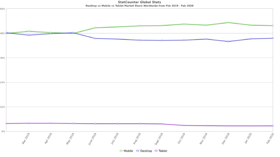
Source: StatCounter Global Stats – Platform Comparison Market Share
Looking at statistics from the last year, you can see at the very beginning, it was neck and neck, with both mobile and desktop sitting around 47% / 48% each. A year later though, and things have changed, mobile overtaking with 51.69% compared to desktops 45.66%.
If you follow the link above and tinker with these charts, you’ll see that this is a trend which was predictable. It also looks like one which isn’t slowing down any time soon.
Well, what now?
With this latest announcement from Google, what should you, as a website owner be concerned about? Well, that depends, is your site responsive? Does the design and content get considered and catered for as the device your viewing your site on gets smaller? Can you see a visible difference between how your site looks on either a mobile or desktop, or do you find yourself pinching, zooming, swiping and tapping multiple times trying to press that one inconveniently small button to get you where you want to be?
As we’ve grown so accustom to mobile browsing, knowing if your site isn’t responsive should be pretty evident. You’ll find it sticks out, it will feel jarring compared to most other places you browse. But if you’re really not sure, Google provides a handy little tool for you to find out. Just enter your websites URL into the input field, after a quick test you’ll be told whether your site is mobile friendly or not, pretty handy!
The Results
So, you’ve run the test and the results weren’t what you were hoping for, fear not! It doesn’t always take a redesign for Google to see your site as mobile friendly. With a powerful styling tool called “Media Queries” we can make your website responsive, a breeze to browse and mostly importantly, earn you some brownie points in the eyes of Google.
If you want to discuss how to improve your site for your mobile browsers, drop us an email and we’ll come back to you with some suggestions on how we can help you move forward.
Luke