10th April, 2026
Colour is often one of the simplest ways to introduce subtle change without overhauling your entire brand. Small, considered adjustments to your palette can help your website and marketing feel more current, while still remaining consistent and recognisable. Below are several spring-inspired colours, along with practical guidance on how they can be used across websites and marketing materials.
These colours aren’t designed to replace your existing brand palette, but to complement it. Used carefully, they can add variety to your visuals, highlight key content and support seasonal campaigns without feeling forced.
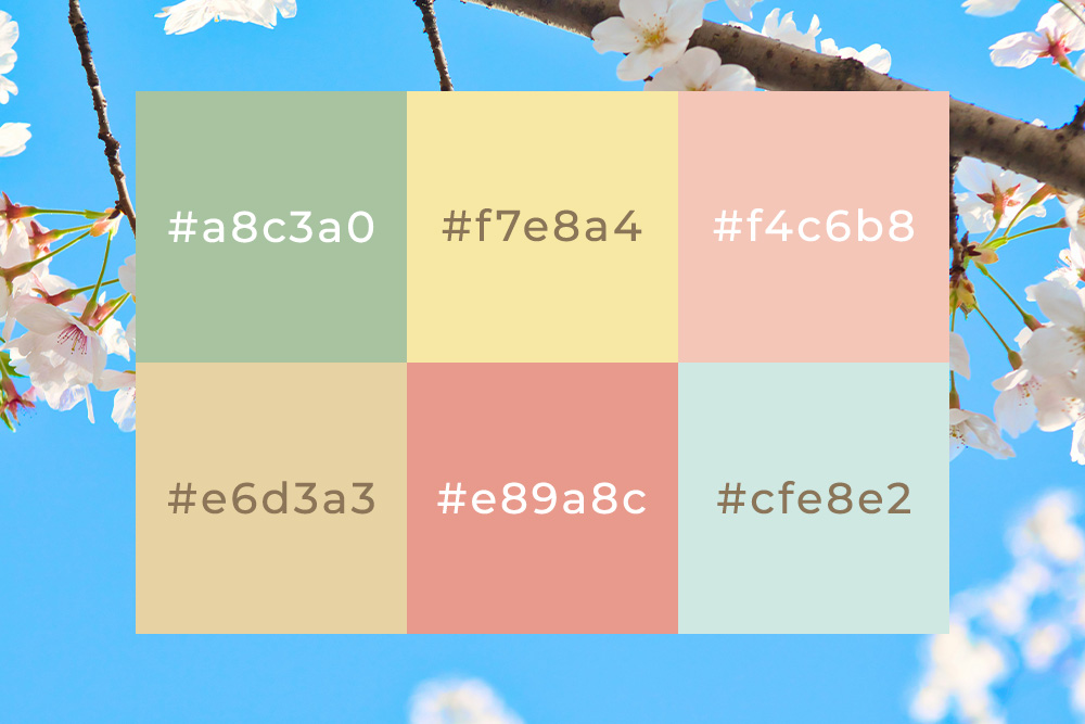
#A8C3A0 – Soft Sage
A muted green that feels calm and balanced. Soft sage works well as a background colour or for larger sections of a page where you want a subtle, natural feel. It’s particularly effective for service-based businesses looking to introduce a seasonal touch without losing a professional tone.
#F7E8A4 – Light Blossom Yellow
A gentle yellow that adds warmth without being overpowering. This is useful for drawing attention to key elements such as calls to action, highlights or featured content. Best used sparingly, it can bring energy to a design without overwhelming it.
#F4C6B8 – Spring Peach
A soft peach tone that introduces warmth and approachability. It works well in marketing materials and social graphics where a slightly more relaxed feel is appropriate. It pairs well with neutral tones and can help soften more structured layouts.
#E6D3A3 – Soft Sand
A light, sandy tone that brings warmth without feeling overly seasonal. It works well as a background colour, particularly on websites that want to soften the contrast of pure white. This is a practical option for service-based businesses looking to introduce warmth while keeping a clean, professional look.
#E89A8C – Coral Accent
A muted coral that adds a touch of energy. This works well for buttons, links or small highlights where you want to guide attention. Used in moderation, it can add personality without disrupting the overall design.
#CFE8E2 – Fresh Mint
A light mint green that brings a sense of freshness and clarity. This colour works well for subtle highlights, icons or secondary elements within a layout. Used alongside darker tones, it can help create contrast without feeling harsh.
Seasonal Creativity
Spring colour palettes don’t need to be bold or dramatic to be effective. In most cases, small adjustments – introduced in the right places – are enough to refresh your website or marketing materials. The key is to keep changes consistent with your brand, focus on usability, and apply colour with purpose rather than decoration. If you’re considering a design refresh or want a second opinion on how to evolve your brand visually, we’re always happy to help.
If you’re planning ahead, you might also find our Festive Colour Palette and Autumn Colour Palette guides useful for future seasonal updates.
Until next time, keep it Tidy!
Mike