13th December, 2025
As we head towards the festive season, colour plays a huge role in setting the mood. From deep, traditional reds to warm metallic tones and soft winter neutrals, festive colour palettes help create that instantly recognisable Christmas feel across websites, branding and seasonal campaigns.
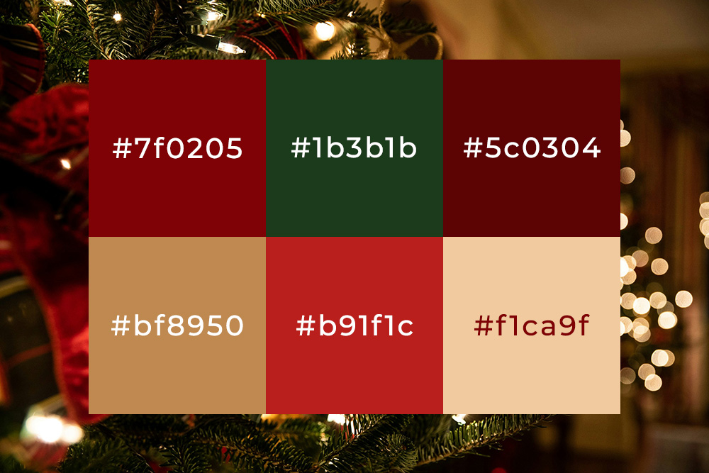
Here is a selection of festive colour codes that work beautifully together and can be used across digital design, marketing materials and seasonal promotions. Explore the colours below and see how each one contributes to that classic festive feel:
#7f0205 – Yuletide Crimson
A deep, rich red that instantly evokes tradition, warmth and Christmas heritage. This shade works perfectly for headings, call-to-action buttons, or festive accents where you want a bold but refined seasonal statement.
#1b3b1b – Evergreen Fir
Inspired by Christmas trees and winter foliage, this dark green adds balance and depth to festive palettes. It pairs especially well with golds and warm neutrals, making it ideal for backgrounds or supporting elements.
#5c0304 – Mulled Wine
A darker, moodier red with a hint of warmth, reminiscent of mulled wine on a cold winter evening. This colour is great for adding contrast, depth, and a slightly more luxurious festive tone.
#bf8950 – Golden Bauble
A soft, warm gold that brings a subtle festive sparkle without overpowering the palette. Perfect for highlights, borders, icons, or decorative details that need a touch of seasonal elegance.
#b91f1c – Holly Berry Red
A classic Christmas red that feels bright, confident and festive. This shade is ideal for call-to-actions, banners, or promotional elements where visibility and impact matter most.
#f1ca9f – Winter Glow
A gentle, warm neutral that softens stronger festive colours. This works beautifully as a background shade or supporting tone, helping to keep festive designs feeling welcoming and easy on the eye.
Seasonal Creativity
Festive colour palettes don’t need to be loud or overcomplicated. By combining a small selection of well-chosen tones, you can create seasonal designs that feel warm, familiar and on-brand. If you enjoyed this post, you may also like our Autumn Colour Palette article, which explores rich seasonal tones ideal for earlier months of the year and transitional design work. If you’d like help applying festive colours to your website, branding or seasonal campaigns, feel free to get in touch with Tidy Design.
Until next time, keep it Tidy!
Mike