13th August, 2017
Today I’m going to give you a short tutorial on how to create a mobile navigation. This mobile navigation will slide in from the left side of the page. Here you will find everything you need to create the nav including how to animate the hamburger icon and the JavaScript needed to open and close the menu.
We will start with the html needed to create the menu:
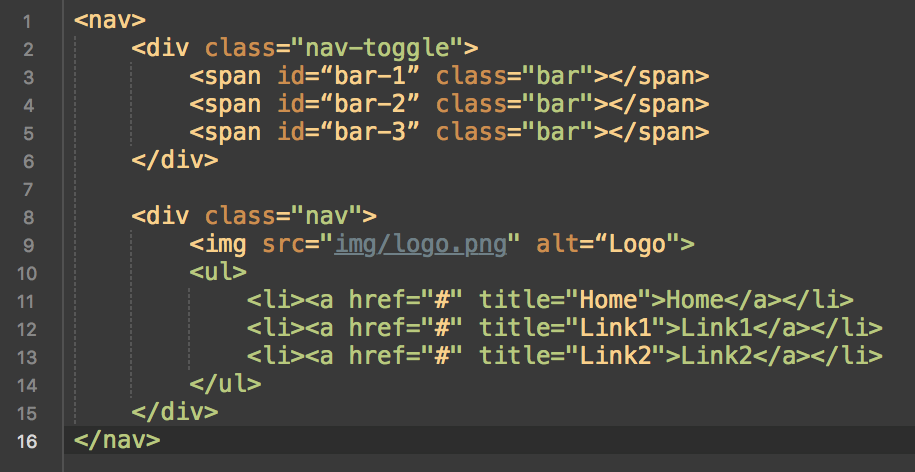
The first step is to wrap the whole navigation in a ‘nav’ tag, this a new HTML5 tag which represents a section of code with the purpose of providing links. Next is the navigation toggle (the div which will be the trigger for opening and closing the nav), this will have a class of ‘nav-toggle’ and contain the hamburger icon to indicate where the user should click to open the menu. Three span elements will be placed into the ‘nav-toggle’ div, these will be used to create the hamburger bars. The main styling of these bars will be implemented using the ‘bar’ class and the positioning will be done through the ‘id’ assigned to them.
Finally we create a div with the class ‘nav’ that’ll hold the logo of the company as well as the ‘ul’ containing all the links needed. For now we will add a ‘#’ inside the ‘href’ as a placeholder, later this will be swapped for the url you’d like the link to direct to. This code will give you the very basic structure ready to be styled with CSS.
Moving on to the styling will start with the ‘nav toggle’. We want this to be set to ‘position: fixed’ so it follows us as we move down the page, if it wasn’t then the user would have to scroll up the page just to open the menu. Once the position is set to ‘fixed’ we can move the toggle to where we’d like it, I want mine to be sat at the top of the page to the left. Here is how:
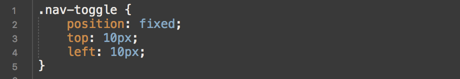
If you’d like yours to sit to the right of the page swap ‘left: 10px’ for ‘right: 10px’.
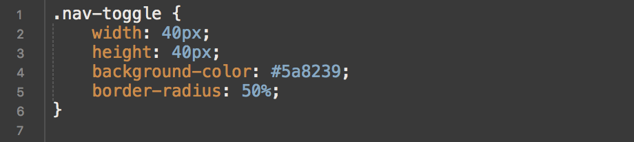
Continuing the styling of the nav toggle we set a height and width of 40px along with a background colour. The colour we’re using in the tutorial is one which matches the clients colour scheme, but you can use any colour you choose. This will leave us with a small green square, we want our toggle to be a circle though so let’s add a border-radius of 50%. Add the following code to the previous block:
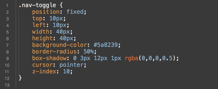
To finish of the main styles for the nav we will add a box-shadow to make it stand out from the page and a z-index so it stays above other elements on the page. Finally we need to set cursor to ‘pointer’, this changes the cursor on hover and without it iOS devices won’t trigger a JavaScript click event. Below is the complete css for ‘nav-toggle’ and how it should look in your browser:
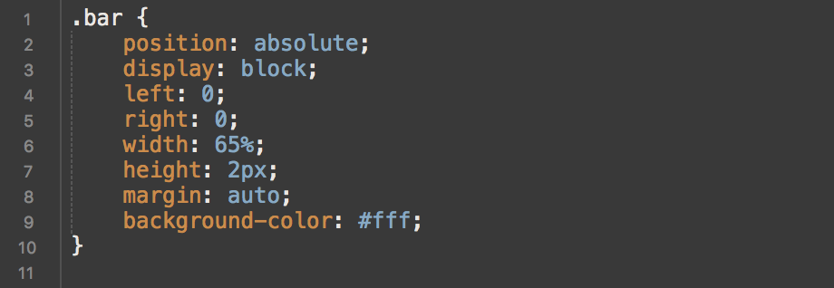
Now we have the toggle styled we need to add the hamburger bars. This is a simple process as the ‘bar’ class has been added to all three necessary elements one block of code will style all three. The CSS is relatively straight forward. ‘Position’ needs to be set to ‘absolute’ so we can move them easily into place, and the ‘display’ set to ‘block’ so it can be given a height and width.
A nice trick here as they’re positioned absolute it to set the margin to auto and left and right to 0, this automatically centres them inside the nav toggle. Here are all the styles needed to make the hamburger bars.
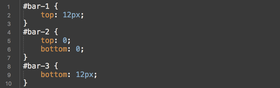
If you were to refresh your page now you’d the nav toggle with one single bar at the very top, this is due to them currently set to the same position. All three bars are there they’re just sat on top of one another. This is where the ID’s come in, we need to target each bars ID and space them out evenly.
We can leave the nav toggle and return later when it comes to animating the hamburger ‘bars’.
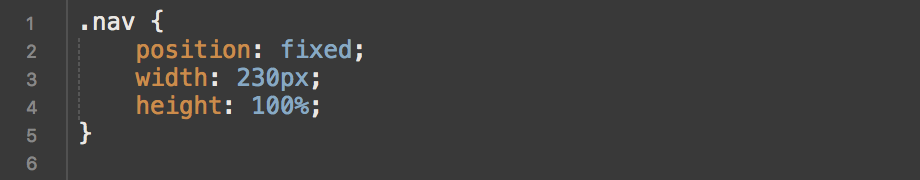
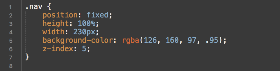
Now for the navigation. We need the nav to stay on the side of page no matter how far the user has scrolled down, for this set the position of ‘.nav’ to fixed. Once the navigation is stuck to our scroll position it’s time to set the height and width. For the height a simple 100% is needed here for it to be the full height of the screen regardless of the device it’s viewed on. Width can be whatever you’d like, for the tutorial we’re going to use 230px. The starting code for the nav should look like this.
The final nav styles for now include a background colour which again is up to you what you choose, we will run with the colour scheme already in use and pick a lighter green that’s slightly transparent. The background colour style will be set to an rgba colour so we can specify the alpha, our is ‘rgba(126, 160, 97, .95)’. To make sure it always sits on top of the page elements a z-index of 5 needs to be set. The complete nav styles so far are:
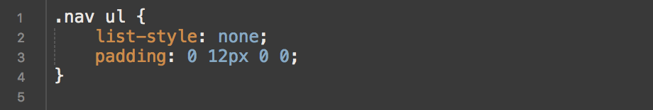
Next is a very simple setup for the ul, only two styles needed here. First being ‘list-style: none’ this removes the the bullet points next the list items. The second style is for the padding, removing the default padding and adding a slight bit of padding to the right, we will use the shorthand here and set all 4 sides with one line ‘padding: 0 12px 0 0’.
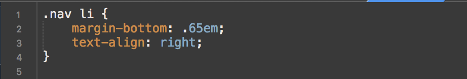
For the list items themselves we only need another two styles, the font styling itself will be placed on the ‘a’ tag within the list items. Here we space out the list items with a margin bottom of .65em and align the text to the right.
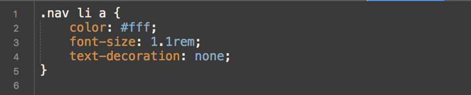
On the ‘a’ tag we will set the font size, font colour and the remove the default underline an ‘a’ tag gives. You will see the sizes and colour we use below but you can pick your own to match the project you’re working on.
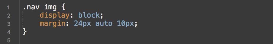
When it comes to nav logo depending on the size and content you may need to style this differently than us but for the logo the client uses to position it properly we use the following styles.
Now the nav is completely styled we can move on to making it functional. The first part of making it functional is to hide the nav from view, this is done with a transform style. We need to add ‘transform: translateX(-100%)’ to the ‘.nav’, this hides the nav off the page to the left.
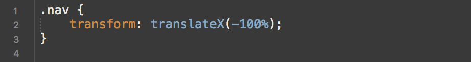
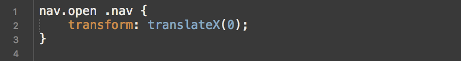
We also need to create the class that we will add to the nav later with javascript. We add this class to the containing nav element in CSS and call this class open with the style ‘transform: translateX(0)’. When this class has been added the nav will sit where it did before we added the previous ‘transform: translateX(-100%)’.
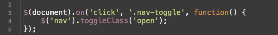
The javascript is actually a very simple piece of code which once ‘.nav-toggle’ has been clicked toggles the class ‘open’ on the nav element. It’s the only piece of code needed and looks like this: (Make sure you have jQuery added to your project)
If you test this now you will notice two things, first being that when the nav shows it just jumps into place rather that sliding smoothly. Second, the nav toggle doesn’t indicate in anyway that it’s been clicked. We will change these two things now.
Starting with the animation side of things we will add a transition to a few elements to make sure that the nav slides in and the nav toggle bars will animate properly.
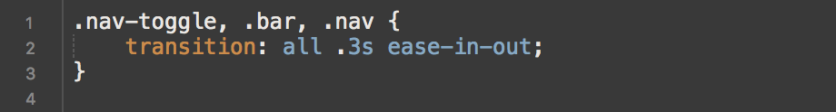
Another quick test and you will see the nav now slides in and out smoothly, you can either speed or slow down this transition by changing the .3s for whatever you’d like.
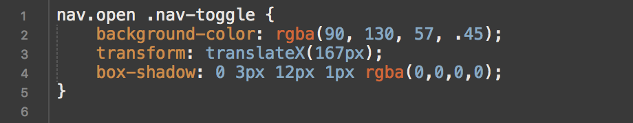
The very last part of this is to animate to nav toggle and hamburger bars on click. We need to add a few styles to the ‘.nav-toggle’ container, these being the position, background colour and box-shadow colour. We add a transform set to ‘transform: translateX(167px)’, if you changed the width of the nav you may need to adjust this. The background colour change is just to make it slightly more transparent and the box shadow is to change it to completely transparent. The styles for these changes are:
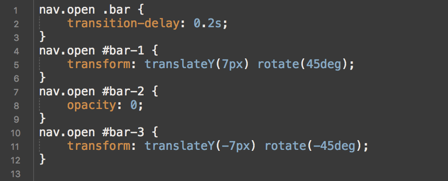
The styles for the hamburger bars are simple but effective, we start by adding a transition delay to ‘.bars’ which applies to all 3 and then move to individually styling each bar. The first bar takes a transform which moves it down 7px and rotates it 45 degrees. The second bar gets hidden by an opacity set to 0. And last but not least the third bar gives given the same styles applied as the first but swapped to negative, it’s moved up by -7px and rotated -45 degrees. All 4 style declarations are below for you to see.
If you’ve followed this tutorial through you should now have a fully functional nav bar that’ll work and look great on both mobile and desktops. We will shortly be adding a demo page where you can interact and dissect it if you curious about anything… Enjoy!
Luke