7th September, 2018
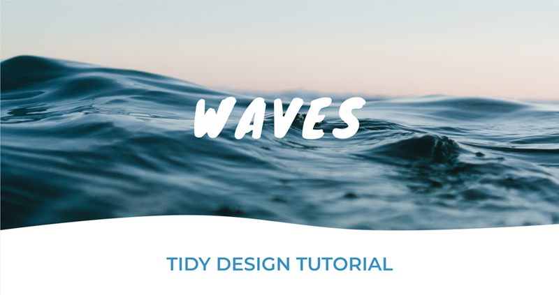
Today I’m going to show you a way to change up the standard straight lines below your header images, we’re going to use a wave in this tutorial but any shapes you like will be suitable.
This process is done by creating an SVG and placing this into the HTML file below your header> (or whatever container you’d like). I’ll be using Figma to create my SVG overlay, but you can use any SVG editor to achieve these results, just note that some steps may be slightly different. There’s a couple other SVG editors you can choose from if you haven’t got Figma (a free piece of software), one being Adobe Illustrator and another the free editor InkScape. Now we’re sorted on what we’ll need to continue, let’s jump in!
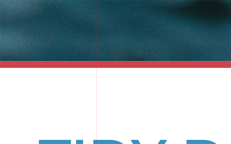
I’ve placed in a background image on the pages to replicate a header area, this is purely to keep a nice visual representation of how it’ll look once live. The first step will be to place a rectangle on top the header image, let’s put this at the bottom of the image. I made the rectangle 6px high choosing a bright red to help it stand out. I also added some guidelines to visually separate the page into 3 sections.

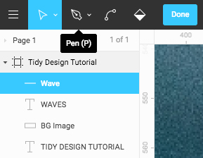
From here you’ll need to double click the red rectangle, you should now see diagonal lines over the shape when hovered over. With that done move up to the toolbar at the top and select the pen tool.
Zoom into the first of the guidelines and click on the intersect between the guideline and the top of the rectangle, make sure to hit the escape key to create just one single point. Scroll along and do the same on the second guideline.

Before you zoom out head all the way to the right, use the move/select tool and drag the top right point of the rectangle up 10px – 15px.

Now zoom back out and you should see something similar to this…

Still using the move/select tool grab the point on the first guideline and drag it up in straight line. How high you drag this up determines how big your wave will be.

This next step is where we’ll see the curve of the wave taking shape. Double click on the red shape and move up to the toolbar in the top left to select the bend tool. The next step is to click on the two points over the guidelines…
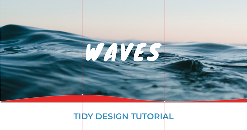
Simple, right? Now you’ve got a crisp wave like topped rectangle, we just need to export it to be used on the web. With the wave selected look to the sidebar on the right of the page, the last option you should see under the Design tab is Export, select SVG from the drop down, hit export and now it’s saved ready for use.

Here’s the SVG code I’m left with, you should see something similar:
<svg width="1440" height="45" viewBox="0 0 1440 45" fill="none" xmlns="http://www.w3.org/2000/svg">
  <path d="M0 39C0 39 291.625 0.0315932 479.5 0C667.764 -0.0316586 771.789 34.5337 960 39C1147.5 43.4495 1440 23 1440 23V45H0V39Z" fill="white"/>
</svg>
We just need to make a couple of changes to this, one so we can easily refer to it and the other to help make it responsive. These changes are only on the first line, we need to add an ID and also remove both the width and height attributes (the fill attribute is unnecessary and can go too):
<svg id="wave" viewBox="0 0 1440 45" xmlns="http://www.w3.org/2000/svg">
<path d="M0 39C0 39 291.625 0.0315932 479.5 0C667.764 -0.0316586 771.789 34.5337 960 39C1147.5 43.4495 1440 23 1440 23V45H0V39Z" fill="white"/>
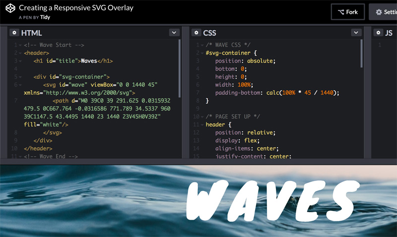
</svg>Right! We’re ready to get to the code now… We’re going to need a header tag with a background image, and a container for our SVG code:
<header>
  <h1>Waves</h1>
  <div class="svg-container"></div>
</header>
The container is needed to keep the SVG to the right aspect ratio, without it you’ll be able to get the SVG to be as wide as the container but it’ll also take up the height of the container. So paste in the SVG code into the container and we’re a handful of CSS lines away from completing this. First, we need to make the header tag position relative, and add the following styles to the SVG container:
.svg-container {
  position: absolute;
  bottom: 0;
  width: 100%;
  height: 0;
}
You’re probably thinking “I’m not seeing the SVG!”, the last piece to finish this off is taking advantage of the old padding bottom trick. We need to calculate the aspect ratio, a simple formula by multiplying the percentage width by the viewBox height, divided by the viewBox width. Let’s break that down, our percentage width, as we want it to be full screen, is 100%, our viewBox is ‘viewBox=”0 0 1440 45″‘ therefore the CSS value will be: padding-bottom: calc(100% * 45 / 1400);
Change the values to what yours needs to be and, boom! Now you’ll see the wave sat perfectly at the bottom of the header. If you want to see a live example, please see this Codepen Pen;
https://codepen.io/TidyDesign/pen/xaPVoR
Luke