12th July, 2012
Customers are increasing accessing websites via mobiles, net books and tablets, using a wide range of browsers. To ensure that your company website is crafted in a way that both anticipates and responds to your customer’s needs is of vital importance to every business.
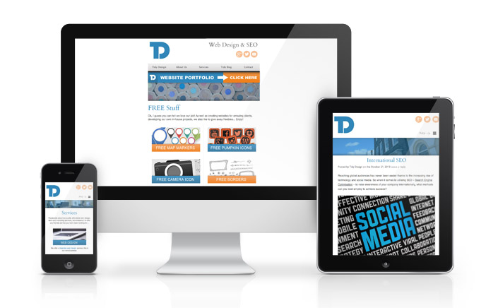
Responsive Web Design (RWD) is the term used to describe how a web site is adapted to suit its viewing environment – using media queries, fluid grids and flexible images to help deliver an enjoyable user experience, no matter how large or small the display of information required.
Responsive Web Design works to ensure that across a wide range of devices and browsers, users are able to access clearly laid out, easy to read content in an easy to navigate format, minimizing the need to endlessly scroll, pan out or resize.
Optimizing website information for mobile devices is a highly skilled process, requiring a fresh look at design and development tailored to respond directly to the user’s experience, based on variables such as screen size and orientation. For example for a customer making the transition from desktop PC to iPad, the website will need the ability to update in response, accommodating resolution and image sizes.
More and more new devices are coming onto the market, each with their own variations in size and functionality, whether it is the increasingly popular iPhone, iPad or multiple Smartphone’s. Many of these devices offer both portrait and landscape viewing formats as well as multiple varieties of screen sizes.
Smart fixes and solutions can be applied to your website, image resolution and download times are of course of vital consideration when considering mobile devices and data transfer charges. Resizing images proportionately and shrinking image resolution on smaller devices is becoming a must!
When it comes to making your website responsive, multiple style sheets can be coded to fit a range of different dimensions / devices – accommodating for landscape and portrait orientations.
Here at Tidy Design we are always more than happy to help with any queries you may have about responsive website designs. Why not contact us today to find our more about how mobile websites and responsive web design can help you with your business.
Stay tuned for some responsive examples and tidy tutorials…