12th September, 2018
Today’s Tidy Tutorial is going to look at a take on a mobile nav, showcasing a curtain style open and close animation with fading nav links.
To get started, let’s go over a couple of items being used in this tutorial. We’re going to be using BEM & SCSS, BEM (Block Element Modifier) is a CSS naming convention, and SCSS is a CSS preprocessor. These two work in hand beautifully.
We’re going to want a starting point for this tutorial, so lets add some simple markup and styles.
HTML Starting Point:
<!DOCTYPE html>
<html>
<head>
  <meta charset="utf-8" />
  <meta http-equiv="X-UA-Compatible" content="IE=edge">
  <title>Curtain Mobile Nav</title>
  <meta name="viewport" content="width=device-width, initial-scale=1">
</head>
<body>

  <header class="header">
    <h1 class="header__title">Mobile Nav</h1>
  </header>

</body>
</html>
SCSS Starting Point:
*,::after,::before {
  box-sizing: border-box;
}

body {
  overflow-x: hidden;
}

.toggle {
  cursor: pointer;
}

.header {
  display: flex;
  align-items: center;
  justify-content: center;
  height: 650px;
  background-image: linear-gradient(-14deg, rgba(0, 19, 39,.45), rgba(24, 24, 24,.65)), url('https://images.unsplash.com/photo-1502033491742-0e11fb057e16?ixlib=rb-0.3.5&ixid=eyJhcHBfaWQiOjEyMDd9&s=9bc0ec5be8f30ca2719b36ca0b270159&auto=format&fit=crop&w=2089&q=80');
  background-size: cover;
  background-position: 44.5% center;
  color: #fff;
  font-family: 'Overlock', cursive;
  text-transform: uppercase;

  &__title {
    font-size: 2.5rem;
    letter-spacing: 2.5px;
  }

  &__toggle {
    position: absolute;
    top: 1em;
    right: 1em;
  }
}
This gives us a basic starting point to build upon. Now, lets starting working on the nav!
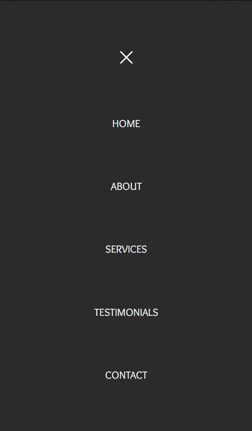
A free Mobile Nav Tutorial
We’re going to need the HTML structure of the nav, which is going to look like this:
<header class="header">

  <h1 class="header__title">Mobile Nav</h1>

  <svg class="header__toggle toggle toggle--open" width="26" height="20" fill="none" xmlns="http://www.w3.org/2000/svg">
    <path class="toggle__path" d="M0 18a1 1 0 011-1h24a1 1 0 110 2H1a1 1 0 01-1-1zM0 10a1 1 0 011-1h24a1 1 0 110 2H1a1 1 0 01-1-1zM0 2a1 1 0 011-1h24a1 1 0 110 2H1a1 1 0 01-1-1z" fill="#fff"></path>
  </svg>

  <nav class="nav">
    <ul class="nav__list">
      <li class="nav__item">
        <svg class="nav__toggle toggle toggle--close" width="26" height="20" fill="none" xmlns="http://www.w3.org/2000/svg">
          <path class="toggle__path" d="M3.707 19.092a1 1 0 010-1.414L20.677.708a1 1 0 111.415 1.413l-16.97 16.97a1 1 0 01-1.415 0z" fill="#fff"></path>
          <path class="toggle__path" d="M3.707.707a1 1 0 011.414 0l16.97 16.97a1 1 0 11-1.414 1.415L3.707 2.122a1 1 0 010-1.415z" fill="#fff"></path>
        </svg>
      </li>
      <li class="nav__item">
        <a class="nav__link" href="#">Home</a>
      </li>
      <li class="nav__item">
        <a class="nav__link" href="#">About</a>
      </li>
      <li class="nav__item">
        <a class="nav__link" href="#">Services</a>
      </li>
      <li class="nav__item">
        <a class="nav__link" href="#">Testimonials</a>
      </li>
      <li class="nav__item">
        <a class="nav__link" href="#">Contact</a>
      </li>
    </ul>
  </nav>

</header>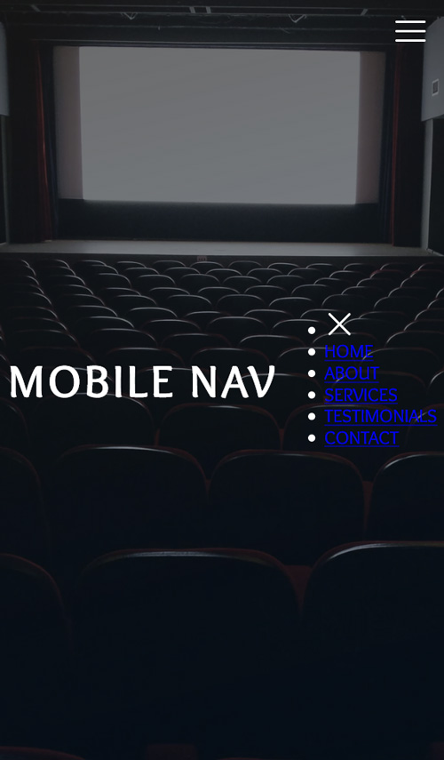
There’s nothing out of the ordinary here, looking at the above code block above it’s a pretty standard nav structure. The only item which could be considered an oddity is the SVG close button being the first nav item – this is purely so we can get our spacing automatically calculated for all nav items. Now we start styling the nav:
.nav {
  position: fixed;
  top: 0;
  left: 0;
  right: 0;
  bottom: 0;
  z-index: 10;
  overflow: hidden;
  pointer-events: none; // Stops clicks registering on the nav when it's not opened
}
This first SCSS block will place the nav above the page’s content. We use pointer-events set to none to let the nav be present in its position, but not engageable.
Right now everything is quite squished, so we need to make the UL the same height as the nav, as well as spacing out the links:
.nav {
  ...

  &__list {
    position: relative;
    display: flex;
    flex-direction: column;
    justify-content: space-evenly;
    align-items: center;
    height: 100%;
    z-index: 10;

    // Reset default UL styles
    margin: 0;
    padding: 0;
    list-style: none;
  }

  &__item {
    margin: 0;
  }

  &__link {
    color: #fff;
    text-decoration: none;
  }
}
Here we’re using the beauty of flex to automatically evenly space out the links. If you’re unsure on any of the styles around flex then check this post from CSS Tricks, everything you’ll need to know will be covered: css-tricks.com/snippets/css/a-guide-to-flexbox/
Time to add in the curtain effects styles, we’re going to use pseudo elements to achieve this. We’ll start by creating both and deal with the positioning of each after:
.nav {
...
&:before,
&:after {
content: '';
position: absolute;
top: 0;
bottom: 0;
width: 50%;
background-color: #2b2b2b;
z-index: 5;
}
...
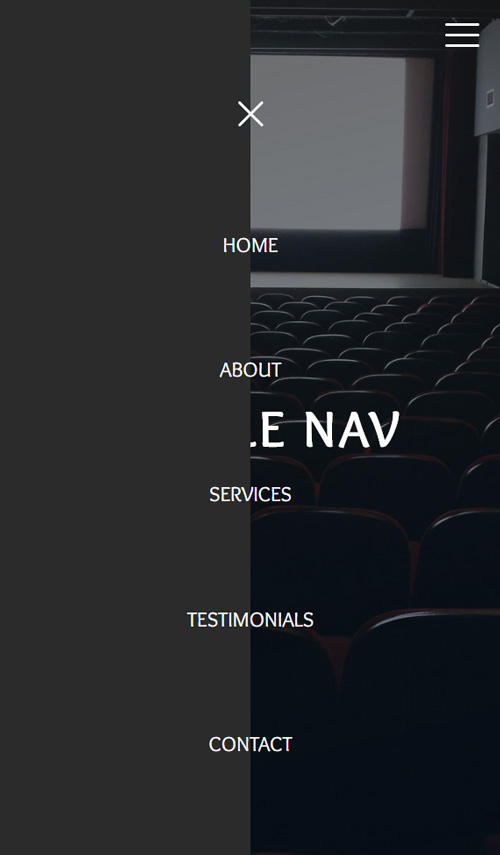
}You’re going to see a rectangle now that takes up half of the page, this rectangle is both our curtain sides placed on top of each other…
:before is our left “curtain”, :after will be the right. We need to move the :after pseudo element to the right side. We will do this with the following style:
.nav {
  ...

  &:after {
    right: 0;
  }

  ...
}
Now your whole screen should be covered by the “curtains”. These need to be hidden off screen though so they can be animated in later. Simple transforms are how we do this, adding a minus to the :before’s style to move this to the left:
.nav {
  ...

  &:before {
    transform: translate(-100%);
  }

  &:after {
    right: 0;
    transform: translate(100%);
  }

  ...
}
Now the majority of styles have been completed, but before we move on we need to hide the nav when we don’t need it. To do this we need set the nav items to have an opacity of 0. The whole of the nav styles so far should be:
.nav {
  position: fixed;
  top: 0;
  left: 0;
  right: 0;
  bottom: 0;
  z-index: 10;
  overflow: hidden;
  pointer-events: none; // Stops clicks registering on the nav when it's not opened

  &:before,
  &:after {
    content: '';
    position: absolute;
    top: 0;
    bottom: 0;
    width: 50%;
    background-color: #2b2b2b;
    z-index: 5;
  }

  &:before {
    transform: translate(-100%);
  }

  &:after {
    right: 0;
    transform: translate(100%);
  }

  &__list {
    position: relative;
    display: flex;
    flex-direction: column;
    justify-content: space-evenly;
    align-items: center;
    height: 100%;
    z-index: 10;

    // Reset default UL styles
    margin: 0;
    padding: 0;
    list-style: none;
  }

  &__item {
    margin: 0;
    opacity: 0;
  }

  &__link {
    color: #fff;
    text-decoration: none;
  }
}
Next we’re going to need to add the only JS side to this tutorial, a simple class added to the nav element will be what triggers the opening and closing of the nav. We just need one event listener which is going to toggle the class, it doesn’t get much simpler than this. It’s good practice to let Javascript to the minimum amount of work possible, let your styles take care of what they can.
document.addEventListener('click', event => {
    const { target } = event;

    if (target.closest('.toggle')) {
        const nav = document.querySelector('.nav');

        nav.classList.toggle('nav--open');
    }
});
In our JS we make use of event delegation, any other click event we need later can be added here, rather than declaring an event for every click we want to register.
That’s the JS done, everything else is going to run through SCSS. All the styles which deal with the open nav are going to be contained within the open modifier. Starting with these following few styles we make it so the mobile nav is able to be opened.
.nav {
  ...
  $nav: &; // This makes sure we can refer back to the nav once inside &--open

  &--open {
    pointer-events: auto; // Lets clicks be registered

    &:before,
    &:after {
      transform: translate(0); // Brings in the curtains
    }

    #{$nav}__item {
      opacity: 1;
    }
  }

  ...
}
The menu will now toggle between showing, and not. You’ll notice though, the menu shows instantly, we’re going to fix that now:
.nav {
  ...

  &:before,
  &:after {
    ...
    transition-property: transform;
    transition-duration: .5s;
    transition-timing-function: ease-in-out;
  }

  ...
}
You can tweak this style however you like, the timings can make a big difference but the biggest impact can be made through the timing function. We’re using ease-in-out, but play around with other standard timings, or even try creating your own cubic bezier (here’s a great site for helping you create your own cubic-bezier.com).
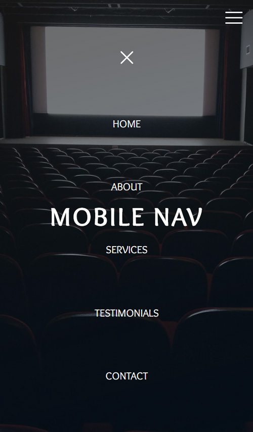
Toggle between the open and closed state now and you’ll see the curtain elements open and close properly. Now the curtains animate correctly we can tackle the links, currently they show and hide instantly, we want these to appear after the curtains have shown
We’ll start by getting the nav links to show once the curtains have closed, to do this we set the transition duration and delay. The delay needs to be set for longer than the curtains’ transition duration:
.nav {
  ...
  $nav: &;

  &__item {
    ...
    transition-property: opacity;
    transition-duration: .5s;
  }

  &--open {
    #{$nav}__item {
      transition-delay: .65s;
    }
  }

  ...
}
The reason we’re breaking out the transition declarations into their long form is so we can override them individually. Setting the delay on the nav–open modifier means we can provide different times for both the opening and closing sections of this transitions. We want the nav items to fade out first on the closing – to do this we’ll set the transition delay to 0 on the just the ‘.nav__item’ class:
.nav {
  ...

  &__item {
    ...
    transition-delay: 0s;
  }

  ...
}
We’re nearly there! We just need one final tweak. This is to make the curtains transition out after the links have faded out. We need to add the delay onto the nav before and afters, also adding a delay to the nav–open before and after of 0s to keep the curtains opening first on the initial menu opening:
.nav {
  ...

  &:before,
  &:after {
    ...
    transition-delay: .65s;
  }

  &--open {
    ...

    &:before,
    &:after {
      transition-delay: .0s;
    }
  }

  ...
}
There we have it, a completed mobile curtain like navigation. There are a few quirks of CSS to overcome along the way but the final product is worthy of that extra effort. Then Pen contains the full styles, markup and JS. Have a play around with the styles in the Pen and see what you can come up with!
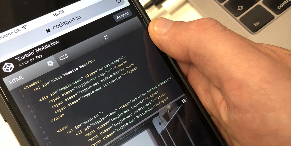
https://codepen.io/TidyDesign/pen/OJygPwr
Thank you for reading, we hope you enjoyed this mobile nav tutorial, until next time!
Luke