26th February, 2016
Layouts have not changed an awful lot since the release of CSS3 and HTML5. The days of using tables to layout a website are long gone yet websites still feel table like. There are benefits of having an unorthodox layout. No matter your trade you will always have competitors and I bet a lot of those competitors have similar websites (table like). Will a user remember one hundred similar layouts or the one that was different?
Diamonds
CSS3 has really changed the way we can style elements on a page. Using transform we can alter the appearance of nearly any element. Giving us the power to create some really unique layouts. Rotating squares into diamonds is one of the more basic examples; nonetheless very unique compared to its square cousin.
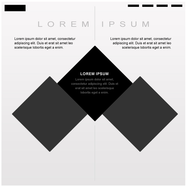
The layout I have created can be used in a number of ways. An e-commerce store may use the two side diamonds as links for either men or women. They could be used as image placeholders to accompany the text in the centre. Whatever you choose this is a sure fired way to ensure a memorable site.
Box Overlay
Overlaying boxes on a traditional looking website can really impact its appearance and break the mould. Using shadows you can effectively turn the content inside into high priority areas for your call to actions (cta). Users are more likely to scan those areas of the page before anywhere else. Overlapping the boundaries of the layout beneath can also add to the effect.
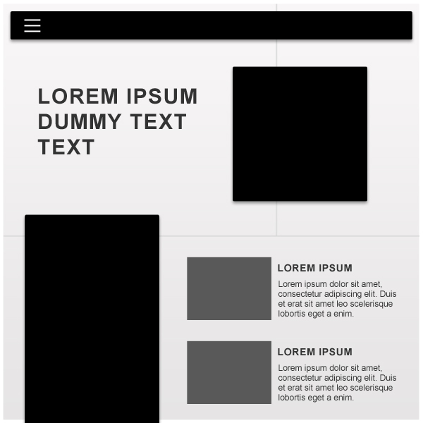
This layout would be great for a personal blog, the longer box to the left can act as an effective side bar while the posts can be placed to the right. The featured post can occupy the top of the page, its image being inside of the overlaying square.
Masonry
There are a couple of ways to achieving this effect. The easiest is to use a Javascript grid layout library called Masonry, it sorts all of the boxes into optimal positions to prevent huge vertical spaces. As quoted from their website “sort of like a mason fitting stones into a wall”. This means you can have many different shapes and sizes all fitting nicely next to and beneath one another.
The sidebar is also a less common feature and takes up a fraction of the space compared to more traditional versions. Using icons and single words allows the sidebar to become less of a prominent feature but remaining just as useful.
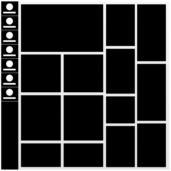
This layout again can be used for blogs but also for dashboards. The boxes can contain important information for the website owner such as statistics or quick actions etc.
Marginless
This final concept is the most traditional looking of them all but it still has its unique qualities. The majority of websites use CSS to include margin between their sections. A marginless layout throws that out of the window and uses padding instead to create its white space. If you can get the correct colours and images then these layouts can look amazing.
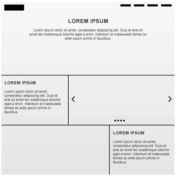
These types of sites are great if your trying to sell a single product or advertise your business online.
Hopefully by now you have a few ideas you can take away with you to start building some truly unique looking layouts. It does however take more then just a great layout to build a memorable website but its the foundation on which everything else will be placed. Have a favourite layout? let us know in the comments.
Blayne Phillips